A1 FINAL PIECE:

NAME TAG (49mm x 90mm) :

As you can see for the name badge we were asked to put our typeface into context and create a word (our partners name), this task was a fairly flexible as we were aloud to input colour, adjust the background and use manipulate the size of each letter form if we pleased. As you can see I decided to apply colour to my name badge for my partner, I decided on a velvet purple as my partner had outlined in the initial research stages that her favourite colour was purple, therefore I decided this would be appropriate. Along with adding colour into the badge i also decided to skew the alignment of the each letterform to give this distorted finish to the badge and add to this illustrative hand crafted design.
However after producing the badge and printing it out and presenting it to my group during the critique I found that it didn't work as well as I initially intended it too do so. After receiving feedback from my critique I became aware that this off-alignment technique which I had added to it didn't seem to work very well and created a visual inequality.
DEVELOPMENTAL WORK:
In order to construct a typeface that would reflect my partners personality I decided to approach the developmental stages of my work by firstly working with the variations of Gill Sans as mentioned in my research, along with using the designers that my partner outlined that she finds inspirational.
ALONG WITH THE NEXT WRITTEN UNDERNEATH EACH GROUP OF IMAGES THERE ARE ALSO FURTHER NOTES AND DECISION MAKING NOTES/REFERENCES WITHIN THE ANNOTATIONS ON THE ACTUAL SKETCHBOOK IMAGE ITSELF.
INITIAL QUICK SKETCHES:

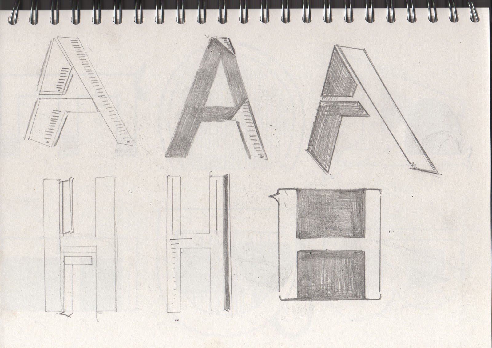

I started by sketching quickly some rough designs by looking at the artist my partner liked, although they are not to scale or there was no accuracy or precision to them I felt that it was necessary to quickly sketch my initial thoughts and responses as they may become useful during the latter development stages. As you can see some of them have not even been fully depicted as the creative flow may have diffused and dispersed away during the construction.
USING INFLUENCE OF JESSICA HISCHE:


After producing them initial designs in the first developmental stage I moved onto combining Gill Sans std. with elements of Jessica Hische work which included adding serifs onto the necessary characters along with adding patterned detail into the inner area of the character (as my partner made it aware to me that she like body art such as tattoo's and the design was fairly similar within Hische's work. Along with using the Gill Sans std. typeface I decided to also experiment with the typeface so see whether the outcome would still maintain its formality.
USING INFLUENCE OF CRAIG WARD:


As you can see from my research on my design context blog a consistent element within Craig Ward's work is the fluidity of his typographic approach, however within the more formal examples that I have found there seems to be a sense of distortion through the miss-alignment of ascenders and stems. As you can see the medium that I have worked within is pencil, biro and fine liner, the reason behind this is because I felt that I have much more control over these mediums.
USING INFLUENCE OF ALBERTO SEVESO:


After developing type for the previous two designers I decided to stick to attempting to develop Gill Sans and the more simplistic variations of Gill Sans, however within these developmental pages I decided to work with water colour and fine liner as my main two mediums, the reasoning behind this being that the Alberto Seveso (the influencing designer) seems to form his typographic pieces with water colour being the foundation medium, from here onwards he adjusts and develops his work digitally.
USING INFLUENCE OF HOWARD HODGKIN:


Although the inspiration I gained from Howard Hodgkin was from basic traditional print press pieces I found the shapes within his work interesting and reflective of my partners personality, therefore within these pages I decided to extract the formality of shapes within his work and apply and reflect it through my typeface using watercolours.
At this point in time I felt I looked over all of the designs that I had produced so far, after summarising and weighing up the pro's and con'f each design i decided to extract the successful and most reflective elements from each design. I found that using the original Gill Sans standard typeface would be the most appropriate pathway to follow next, I also found that filling in the negatives of the letterform and interesting way to in-formalise the letterform slightly however to still maintain a level of neatness and structure that my partner outlined that she found/finds worthy within a typeface. From here onwards I decided to narrow my developments down to being heavily influenced by Jessica Hische's work along with highlighting my partners love for tattoos, as I feel that tattoos are very personal and reflective of ones personality.

As you can see a break-down construction of all elements that I wanted to include in the letterform along with a three step development to show the way that I have decided to construct each letterform , from here onwards I shall use this 3-step guide to create each letterform in the alphabet along with 6 glyphs.
No comments:
Post a Comment