Sunday 21 October 2012

Applying our typeface to an existing product-LOGO DESIGN


Continuing on from our previous task, we were asked to apply our typeface which we had recently created to an existing product/piece of packaging. This product/packaging could be anything our choice, however our typeface must fit the and work well with the packaging that had been selected. As my typeface is fairly bulky I didn't see it fitting into most daily products such as: washing liquid bottles, perfume bottle, cereal box or anything similar. However after searching for packaging on the internet I came across this chocolate biscuit brand which is fairly known, in the UK and abroad now.

http://www.griesson-debeukelaer.de/uploads/media/Mikado_Promotion_02.jpg

APPLYING MY TYPE:


First step that I took to applying my typeface to the 'Mikado' logo was to hand draw the type on paper, however during hand drawing the type I accidentally positioned the 'A' too much to the right not leaving the 0.5cm distance between the 'K' and 'A', instead the distance between the two characters ended up being 1cm, however I decided to continue to draw the type and not waste time reproducing it.


From this point onwards I decided to continue to construct the logo by adding the round circular shape into the background of the type, after applying this it further came to my realisation that the application of the colour highlighted the gap between the 'K' and the 'A' even more. 

I then decided to edit the spacing between each character in order to create visual equality between each character within the logo, once doing this i increased the brightness and contrast of each layer to make the logo visibly stronger and increase the legibility.

Once dropping the red circular shape into the background of the image I had to get rid of the redness in-between where the characters intersected the red background. Although I have created this by hand and fulfilled the task requirements I intend to take this design into Adobe Illustrator once I have adapted to the functions on illustrator and developed my skills using the program. 

STUDIO BRIEF 3 - ALPHABET SOUP - ILLUSTRATOR

Continuing on from our Alphabet Soup brief we were further asked to select one out of the five designs we had produced and develop it on Adobe Illustrator using the pen tool to make it into a vector. After being taught the basic skills (such as how to use the pen tool and how to live trace curved lines) necessary on Adobe illustrator in our tutorials we were asked to create the full alphabet on Adobe Illustrator. The alphabet could either be upper or lower case, however the only restriction within this brief was that we were only allowed to apply one colour to the typeface out of CMYK (cyan, magenta, yellow or key).   

The design that I chose from the five produced from the previous brief:


The reason I decided to go for this design is firstly because it was the design that was selected as one of the five from the entire year group critic, it was left on the wall and my peers thought that it represented my word 'Layers' very well, and secondly because I felt the design seemed simplistic enough for me to apply the basic skills I had on Illustrator along with it having enough detail to be aesthetically pleasing. 

During the design process I felt that it was beneficial for me to work six letterforms onto one page as it gave me a larger canvas to work on in order to make sure anchor points and pathways were being located in the correct areas and joining at the correct points. 


After producing the entire upper case alphabet I decided to place all of the letterforms together on one page in order to see how the typeface worked as a set, as you can see from this image below I have kept the colour as black (key) whilst constructing the typeface:


After reflecting upon the design I came to a realisation after looking at the set of letterforms and revisiting them on a number of occasions that some of the letters were not so legible in comparison to others. As they have geometric basis I thought that maybe if I changed the colour used for the typeface it would make some letters more visible thus more legible and readable. 


After changing the colour of the typeface to magenta as we were only allowed to apply one colour (this was one of the deliverable requirements I found that the piece seemed a lot better in black (key), the reason behind is this is to due to the fact that the block coloured areas that the magenta had been applied to seemed to heavy and disoriented the shape of the letterforms and the degraded the structure of the letterform further reducing the legibility, therefore I decided to revert the typeface back into black (key). 

FINAL OUTCOME:

Adobe Illustrator Tutorial

At the beginning of our Illustrator tutorial we were first of all taught the how to set up a 'new canvas art board' I order to start creating a new vector design. We then moved onto learning the basic tools on illustrator such a as the pen tool:


Using tool along with following instructions on the guidance sheet we were asked to simply use the tool to produce the simplistic shapes and curves from the guidance sheet.


As you can see from above we started by producing simplistic shapes such as the star and circle this was to help us get use to drawing straight line and then get us practising how to formulate a curved line. 


After this task we were asked to load this letterform 'g' which had been put on the college system prior to the session, we were then asked to simple apply our new found skills using the pen tool and simple make the letterform into a vector. 


(The template letterform we were given)

(These are all the anchor point which I used to produce my letterform as we can see I used a fair few)


This was my final outcome from applying the pen tool to the letterform, as we can see from the previous image I did used a fair few anchor points therefore the curves on the actual 'g' did turn out fairly rough, I do admit I am not completely happy with this however practising this tool on other curves will improve this. 


After this task we were them shown how to use the 'blend tool', firstly we were asked to create a simple shape of our choice, the size wasn't really necessary the only requirement was for it to be of a reasonable size not to big.  


We then had to plot another shape on the art board this would be the second point in which the blend would lead to and end at. 


We them selected the blend tool which the the one which highlighted on the image above, it consists of a square, rectangle and circle shape logo.

We then selected a corner of each shape and dragged the tool from one corner to another to create this layered type of vector form. After doing so we selected and added colour to the the two shapes. 


Here are some examples of the application of the blend tool:


STUDIO BRIEF 2 - ALPHABET SOUP - TYPEFACE

In response to the studio brief we were given which was to produce a typeface that represents the personality of our partners (Roxxie Blackman) along with producing 26 letters we were asked to produce 6 glyphs to that would also work with the typeface design. The final outcome of the typeface had to be hand crafted onto a A1 piece of tracing paper along with a name tag (49mm x 90mm).

A1 FINAL PIECE:


NAME TAG (49mm x 90mm) :


As you can see for the name badge we were asked to put our typeface into context and create a word (our partners name), this task was a fairly flexible as we were aloud to input colour, adjust the background and use manipulate the size of each letter form if we pleased. As you can see I decided to apply colour to my name badge for my partner, I decided on a velvet purple as my partner had outlined in the initial research stages that her favourite colour was purple, therefore I decided this would be appropriate. Along with adding colour into the badge i also decided to skew the alignment of the each letterform to give this distorted finish to the badge and add to this illustrative hand crafted design. 

However after producing the badge and printing it out and presenting it to my group during the critique I found that it didn't work as well as I initially intended it too do so. After receiving feedback from my critique I became aware that this off-alignment technique which I had added to it didn't seem to work very well and created a visual inequality. 

DEVELOPMENTAL WORK:

In order to construct a typeface that would reflect my partners personality I decided to approach the developmental stages of my work by firstly working with the variations of Gill Sans as mentioned in my research, along with using the designers that my partner outlined that she finds inspirational. 

ALONG WITH THE NEXT WRITTEN UNDERNEATH EACH GROUP OF IMAGES THERE ARE ALSO FURTHER NOTES AND DECISION MAKING NOTES/REFERENCES WITHIN THE ANNOTATIONS ON THE ACTUAL SKETCHBOOK IMAGE ITSELF.


INITIAL QUICK SKETCHES: 


I started by sketching quickly some rough designs by looking at the artist my partner liked, although they are not to scale or there was no accuracy or precision to them I felt that it was necessary to quickly sketch my initial thoughts and responses as they may become useful during the latter development stages. As you can see some of them have not even been fully depicted as the creative flow may have diffused and dispersed away during the construction. 

USING INFLUENCE OF JESSICA HISCHE:


After producing them initial designs in the first developmental stage I moved onto combining Gill Sans std. with elements of Jessica Hische work which included adding serifs onto the necessary characters along with adding patterned detail into the inner area of the character (as my partner made it aware to me that she like body art such as tattoo's and the design was fairly similar within Hische's work. Along with using the Gill Sans std. typeface I decided to also experiment with the typeface so see whether the outcome would still maintain its formality. 


USING INFLUENCE OF CRAIG WARD:


As you can see from my research on my design context blog a consistent element within  Craig Ward's work is the fluidity of his typographic approach, however within the more formal examples that I have found there seems to be a sense of distortion through the miss-alignment of ascenders and stems. As you can see the medium that I have worked within is pencil, biro and fine liner, the reason behind this is because I felt that I have much more control over these mediums. 


USING INFLUENCE OF ALBERTO SEVESO: 


After developing type for the previous two designers I decided to stick to attempting to develop Gill Sans and the more simplistic variations of Gill Sans, however within these developmental pages I decided to work with water colour and fine liner as my main two mediums, the reasoning behind this being that the Alberto Seveso (the influencing designer) seems to form his typographic pieces with water colour being the foundation medium, from here onwards he adjusts and develops his work digitally.


USING INFLUENCE OF HOWARD HODGKIN:


Although the inspiration I gained from Howard Hodgkin was from basic traditional print press pieces I found the shapes within his work interesting and reflective of my partners personality, therefore within these pages I decided to extract the formality of shapes within his work and apply and reflect it through my typeface using watercolours. 

At this point in time I felt I looked over all of the designs that I had produced so far, after summarising and weighing up the pro's and con'f each design i decided to extract the successful and most reflective elements from each design. I found that using the original Gill Sans standard typeface would be the most appropriate pathway to follow next, I also found that filling in the negatives of the letterform and interesting way to in-formalise the letterform slightly however to still maintain a level of neatness and structure that my partner outlined that she found/finds worthy within a typeface. From here onwards I decided to narrow my developments down to being heavily influenced by Jessica Hische's work along with highlighting my partners love for tattoos, as I feel that tattoos are very personal and reflective of ones personality. 


As you can see a break-down construction of all elements that I wanted to include in the letterform along with a three step development to show the way that I have decided to construct each letterform , from here onwards I shall use this 3-step guide to create each letterform in the alphabet along with 6 glyphs. 

Printing techniques


Along with attending tutorials in digital software such a adobe illustrator it is also important for us as propersing designers to learn about traditional print press processes. During our first print induction we were inducted into the health and safety within the print room at Vernon Street, the following week we were inducted in three different types of printing methods:

  • Lino print
  • Mono print 
  • Letterpress 


Along with being shown how to use the traditional print presses which are up to 150 years old however still working and functioning as brilliantly as they first did we also got to practice these printing techniques. In order for the workshop to become relevant within our work we based our prints on the current brief we were working on at this time, the particular brief that I was working on during this induction was: Visual thinking - Alphabet Soup - Typeface.

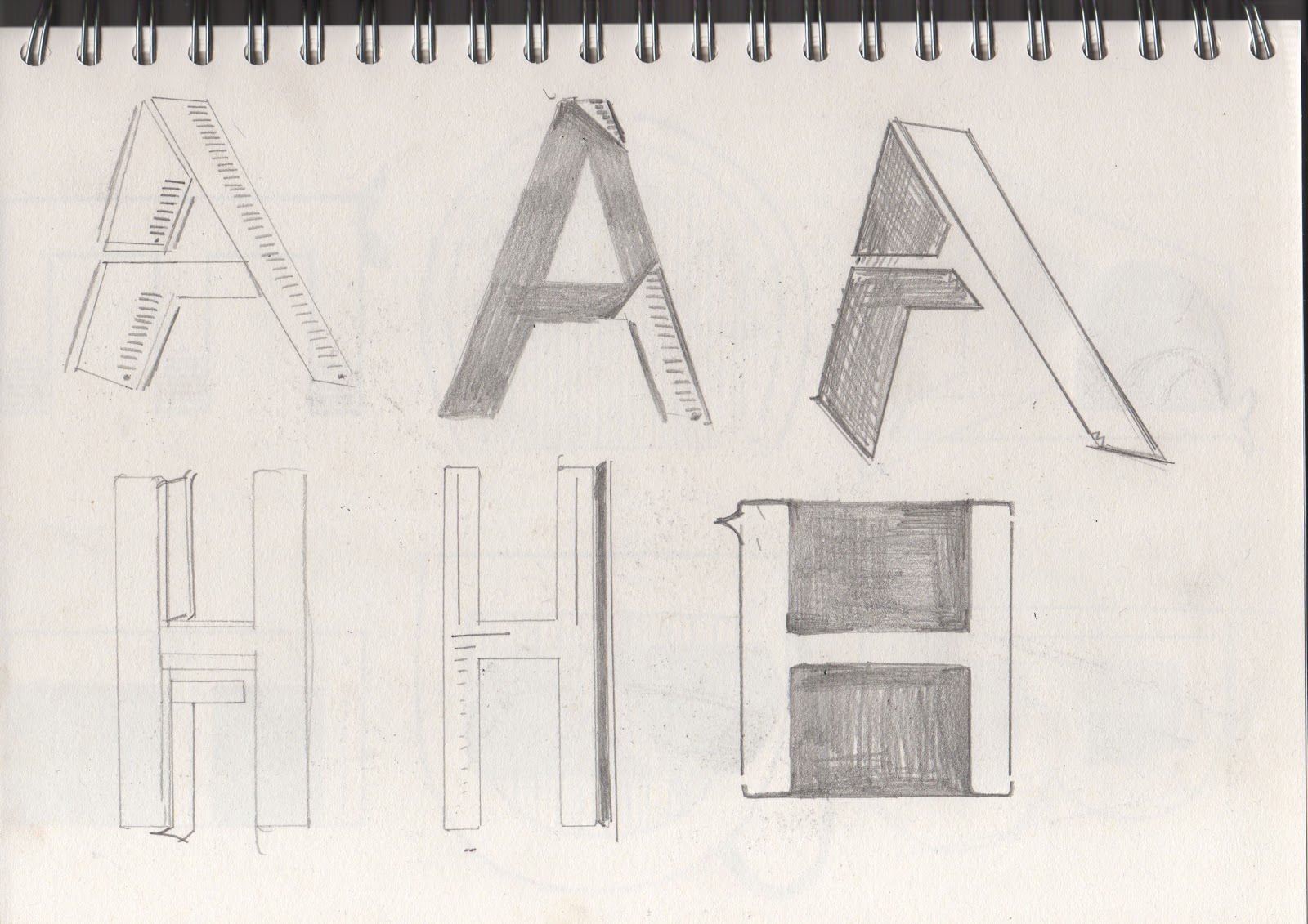
For this reason I decided to work with the research that I had collated so far and the designs which I had produced so far, this consisted of the 10, 10 x 10cm hand drawn letterforms, I decided to pick one in specific as I felt it had a sufficient amount of detail for me to work with however it was not too intricate that I would find print pressing a struggle.

LINO PRINTING WORKSHOP

The first printing method we were shown was 'lino printing', I decided to use my 'A' letterform which I had had drawn for this particular type of print simply because I would be able to engrave the lines into the lino at different depths in order to get a textured print.


As we can see from this image I have simply drawn out my letterform onto the lino in pencil, I have used the same measurements as the hand drawn letterform itself (10x10cm) in order for me to get an accurately balanced triangular shaped 'A'.


After cut out the lino with a gentle stroke of using the cutting blade I had a next to even depth of cut into the lino for each sector.


Although my lino was ready to print I decided not to print this straight away, as I had already experienced lino printing in my past courses I felt that I had fairly good control over the cutting of the lino, I had also learnt previously about different cutting techniques for different outcomes, therefore i decided to cut deeper into certain sections of the lino in order for certain areas to print a lot fainter than other sectors of the lino.


A close up image of the lino which had been prepared to be printed, as you can see the different lines that are of different depths in each sector this will ultimately lead to different areas being fainter than others after bring put through the print press.


I then lay inked my lino up with black ink, placed some news copy paper onto the bottom of the platform, placed my print in the centre of where there were markings to centralise the 10 x 10 cm lino for a centralised print, placed a sheet of A4 cartridge paper onto the lino carefully placed some more news copy paper on top of the A4 sheet of paper so that the the blankets were protected from any ink leakage, put the blankets of the press down on top and rolled the press into positions and pulled the lever so that the heavy metal plate would press my a4 sheet of paper firmly on to my lino.


OUTCOME 1-  This is the original print from the fully inked lino, as we can see it came out fairly solid in colour, the lines on created by cutting the lino into different depths has created this grainy texture. 


OUTCOME 2 - This print is from using the same lino however using the remaining ink on the lino from the previous print, no additional ink had been added to the lino thus the outcome being of a medium tone.


OUTCOME 3 - As we can see I have yet again used the remaining ink on the lino and put it through the press, as the ink has started to dry up the outcome is a lot lighter than the previous two however the shape of the letterform is still clearly visible.

FURTHER LINO PRINTS - W.I.P. 

As I really enjoyed/ have always enjoyed lino printing I decided to continue with this print process by selecting another letterform from my 10, 10 x 10cm designs, this time I decided to go with the letterform 'C'.

Although I have not completed the print and work is still in progress I have posted two images of the cutting stages of the lino below:


WORK-IN-PROGRESS

MONO PRINTING

 Although we were shown how to mono-print I decided to to experiment with this printing process as I have done so manier times before, I felt that it was more important to practice lino printing along with trying out letter pressing which I had never actually practiced before.

As I didn't actually practice this print process I though it was still necessary to outline the steps that you should take during mono printing.

Step 1 - Either get a metal or plastic plate or glass plate anything that is smooth and transferable.

Step 2 - SUBTRACTIVE APPROACH - first ink up the plate using a roller with and oil based ink/paint, make sure the ink is even on the surface, then place shapes which have been cut out of paper or draw into the ink with a pencil/pen to remove the ink in certain areas to create a pattern of some sort.

OR

Step 2 - ADDITIVE APPROACH - Another way of mono-printing is by drawing the design onto the plate using ink then placing your sheet of paper on top.

STEP 3- Simply place a sheet of paper on top of your plate that you wish to print onto and then using a roller , roll back and fourth pressing firmly whilst doing so in order to get a sharp print.


LETTERPRESS

Letterpress is also another type of traditional printing process you simply ink-up the wooden block which has a letterform which is crafter from metal. You then simply press the wooden block down onto a piece of paper firmly so that the ink transfers onto the paper. 


This image above shows first attempt letter pressing, as you we can see this letterpress design was not successful at all, when I was applying pressure onto the wooden letter the ink slipped thus leaving a trail of ink to the left hand side.


As you can see my second attempt was fairly successful in comparison to the first, although the letters did not fully come out in a solid black colour however better than the previous ones. 

 Final outcome - As I didn't get a chance to complete the first word of the letter press I decided just to hand draw the type however the 'SOUP' part of the design is completely letter pressed. 


SCREEN PRINTING