

Before the session on 6th November 2012 we were asked to collate the upper and lower alphabet of five different typefaces which were fundamentally different in there form from the college network, to bring along to the session. We were asked to fit these typefaces onto a A4 sized page and to increase the point size to as large as possible. After a short presentation touching on the anatomy of type and glyphs we were separated into groups into help us with the first task which was set.
This first task consisted of looking at each others typefaces and as a group separating the typefaces into categorised groups, we were asked to decide as a group what the five different categorises should be and from there separate the typefaces accordingly.
As a group we decided to split the categories into:
1) ITALIC SERIFS
2) SERIFS
3) BOLD
4) SANS SERIF
5) VARIED WEIGHTS
1) ITALIC SERIFS

2) SERIFS

3) BOLD

4) SERIFS

5) VARIED WEIGHTS

After discussing with our tutors and realisation as a group that a fair few of our typefaces crossed-over into the different categorises we were asked again to categorise our typefaces into more appropriate groups which would decipher a typeface from another typeface with more clarity. After discussing what we could possibly categorise the typefaces into we were delivered a presentation on a short history of type, we were made aware of the catergories that we could separate the typefaces into these consisted of 'stone', 'sable' , 'bone', 'lead', 'silicon' (digital), methods of letterpress and the materials that they were originally carved on.
1) STONE

2) SABLE

3) BONE

4) LEAD

5) SILICON (Digital)

After this group task which we were asked to do we were then had an entire group discussion on the characteristics of the method of production and characterstics of the letterform for the third part of our task we were asked to quickly establish a word that described each category as a group.
After doing so we swapped table with another group and were set a task to carry out before the next session. This task was to investigate into the typefaces which we now were in possession of from another group, with these five new unknown typefaces we had to investigate there name, date produced , who designed them and point size using identifont.com.
IDENTIFYING TYPEFACES:
1)Hobo
Information about the font Hobo and where to buy it.
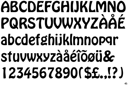
Designer: Morris Fuller Benton
Year: 1910
Copyright: Unknown
Examples: omegle.com
http://www.identifont.com/list?17+id+10+3P8+2+2RJ+2+240+2+5ZI+2+2AG+2+45S+2+4X8+2+8NC+2+9FG+2+6RC+3+N2+3+62R+3+4U4+4+4V9+4+1UY+5+1ZO+6+6FR+6+1UG+7+4NI+7+4QY+8
|
2)Nina (Microsoft)
Information about the font Nina (Microsoft) and where to buy it.
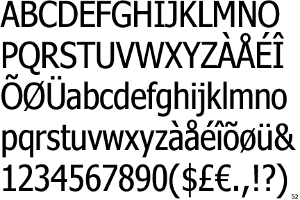
A narrow version of Verdana.
Year: 2000-2001
Publisher: Microsoft Typography
Influenced by:
http://www.identifont.com/identify?20+%20+9J+2BT+G39+5Q+Y+30D+4A+1KS+6X5+1KI+2U+10+6XA+1A+42+53K+1QY+1U+9Z
|
3) Courier
Information about the font Courier and where to buy it.
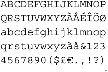
Designer: Howard Kettler
Year: 1956
Included with Apple's Mac OS X Panther (10.3) operating system.
A PostScript version of this font is built in to most PostScript printers.
Influence on:
http://www.identifont.com/identify?21+%20+4Y+58D+JI7+PAF+4A+53K+1L0+19U+2L+3WP+2AAB+4C+1KS+1A+1KI+7VS+1QY+42+7G+A0
|
4) Apple Chancery
Information about the font Apple Chancery and where to buy it.
Publisher: Apple Computer Inc
Included with Apple's Mac OS X Panther (10.3) operating system.
|
5) Colonna
Information about the font Colonna and where to buy it.
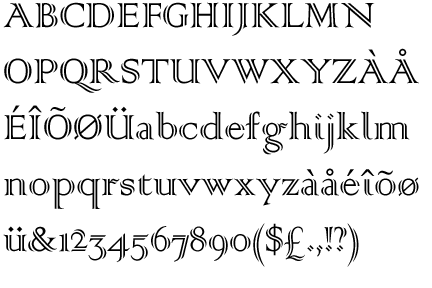
Year: 1927
Copyright: Monotype Classic Fonts
Publisher: Monotype
A TrueType version of this font is provided free with the Microsoft Office Value Pack (Macintosh).
BECOMING AN EXPERT IN : COURIER
As apart of our investigation task after identifying the five unknown typefaces we were given we were then asked to become a 'expert' in one out of the five typefaces we had just discovered, I decided to become an expert in the typeface 'COURIER'.
You are able to the the typeface from the following places:
|


http://www.myfonts.com/fonts/linotype/courier/
Main points:
- One of most recognisable fonts/typeface worldwide.
- Originally designed for typewriter usage.
- Letterforms tend to have same distance in width.
- Origins associated with office and telegram text.
- Mainly used in advertisements.
VARIATIONS OF THE TYPEFACE:
 http://www.myfonts.com/fonts/linotype/courier/
Typeface notes:
Courier is a monospaced typeface for use in tabular material, technical documentation, and word processing. It was designed in the mid-1900s by Howard Kettler of IBM as a typewriter face, and was later redrawn by Adrian Frutiger for the IBM Selectric series.
http://store1.adobe.com/cfusion/store/html/index.cfm?store=OLS-US&event=displayFontPackage&code=1422&PID=930349
- From this website the COURIER family typeface costs $99
No comments:
Post a Comment