http://www.amazon.co.uk/Morecambe-Wise-6-DVD-Eric/dp/B002BX4QAE/ref=sr_1_8?s=dvd&ie=UTF8&qid=1357913792&sr=1-8
After collating this research we then had a peer-to-peer crit on Monday morning (14/01/13), too discuss our ideas and show each other the direction we have decided to take with the given brief. Within the crit I had taken with me all of the research above along with x1 a2 sheet showing initial packaging designs. After discussing with my group my ideas and the direction I want to take with the given brief they feed back how and where I could take my idea from this current point onwards.
I think that this feedback is useful as the next step that I thought I should take prior to this was to look at packaging and consider the actual template I can use in accordance with the resources I have. In terms of the information itself I feel that pinpointing the information would be useful at this stage therefore once carrying out some research on the packaging layout/format I shall collect this information and start to work this with the design sheets created through further research of packaging. Along with researching into the period 0f 50-80's I think I should also try to make the information itself fairly comic and tone down the seriousness of the information in order for it to fit in with the characteristics and humour which the tone of comedy takes.
As I have now looked at different type of packaging thats engaging, I feel that is is important to create mock-up designs to see how interactive these designs are and whether they would be beneficial to use for my dvd packaging. After producing each net I am going to ask my target audience what they think of the each net's interactivity and which packaging they would prefer.
Packaging option 1:
Overall feedback from audience: The tab is difficult to use, thus not ergonomic for the user.
Although the design seemed fairly strong on paper once actually making a half-scale version of the packaging I have found that the tab which closes the entire packaging is weak, not only is the measurement incorrect the actually tab itself looks fairly weak and unsustainable.
Packaging option 2:
Overall feedback from the audience: The size of the actual packaging would probably be to big in accordance to the minimal fold out wings.
Although the mechanisms on this design work simplistically and get the audience to interact with the product I think that when in full scale the packaging will be far to big to sit comfortably on a shelf in the shop and sell.
Packaging option 3:
Overall feedback from the audience: The tabs are no that good, the design itself is a little boring.
This design is fairly simplistic in its construction however the tabs on the inside seem sloppy in a manner, they don't seem sustainable in strong enough to hold the cd in its place when the packaging is open therefore I will not be using this design.
Packaging option 4:
Overall feedback from the audience: The cd may get damaged if it is the on the base of the fold out mechanism.
This design is fairly interactive, however organic in its construction, the cd sits on the base of the design when folded out and the tabs which hold the cd in place are rectangular pieces which are separate or could be part of the net design.
Chosen net:
Experimenting with tabs: As you can see in this design in the centre where the disk is sat I have used two semi-circle tabs to hold the cd in place, however once doing so and looking at the remaining material left I found that the negative of the shape which was cut out seemed beneficial in experimenting with and seeing if this could be used to hold the cd in place.
negative out from the semi-circles which has found to be useful and innovative in holding the cd in place.
Overall audience feedback: There's a lot to engage with in order to get to the dvd itself which is good, the way the dvd is held is interesting in comparison to any of the other net designs.
DESIGN DECISION:
As I and the audience have found this net to be the most interactive and innovative out of the initial designs and the nets that I physically produced I have decided to go with this packaging net and to build my info-graphic design upon this.
FOCUSED PRODUCT & PACKAGING DEVELOPMENT
After selecting the net of the packaging I have decided not to go straight to the development stage as I feel that the design on my packaging is still fairly broad, for this reason I have decided to conduct further product packaging designs which focuses on the positioning of certain type and a rough idea of the some of the ideas that have in mind for the finish product.
Within these designs I have decided to focus on the elements that form the design, the tabs that hold the dvd disc in place along with placing rough sketches of some of the visual elements such as the silhouette/hand rendered design of Morecambe & Wise along with the laughing jaw.
Although I have not produced one net design that I am completely satisfied with I think that producing these focused developments has helped me realise that if I bring particular elements from each design together I will be able to produce one that I'm satisfied with.
HAND DRAWN ELEMENTS FOR THE PACKAGING
As I want to make make my packaging look comic however have a level of formality to it I think that the best way to execute these two stone is to start off by hand drawing some of the main elements I will using on the packaging. Some of the designs I may chose to use on the product in their raw format however with others I will take onto illustrator and convert into vectors. In order to utilise this comical concept I have decided to experiment with materials and medium in order to create the greatest finish.
Morecambe & Wise sketches
Rough drawings and sketches of which could be used for the front of the dvd packaging, morecambe and Wise being the face of the dvd packaging info-graphic
Rough drawings a I started with just sketching on normal white paper using a pencil and then biro as my medium.
After doing so I then started to use a thicker medium, a black marker in order to get a much more dense mark on my page, by using a marker the depth of the line has minimised to amount of detail I can capture within the drawing therefore during constructing the element is was/is important to mark-make only the most important features that define Morecambe & Wise.
Although I am fairly happy with the silhouettes made in the above designs I have decided to see and experiment with the use of a biro on tracing paper to see what the outcome is like.
Tv sketches
Another element that will be on on the packaging design is a tv design, this portrays the idea of british television representing the basis of the dvd content.
After looking at different types of tv's from modern flat screen with pristine edges to looking at traditional tv set I have decided to select the tv set that is more traditional and relates to the 1940's-1980's as this is the period of time that sitcom's that starred Morecambe & Wise were broadcasted on tv.
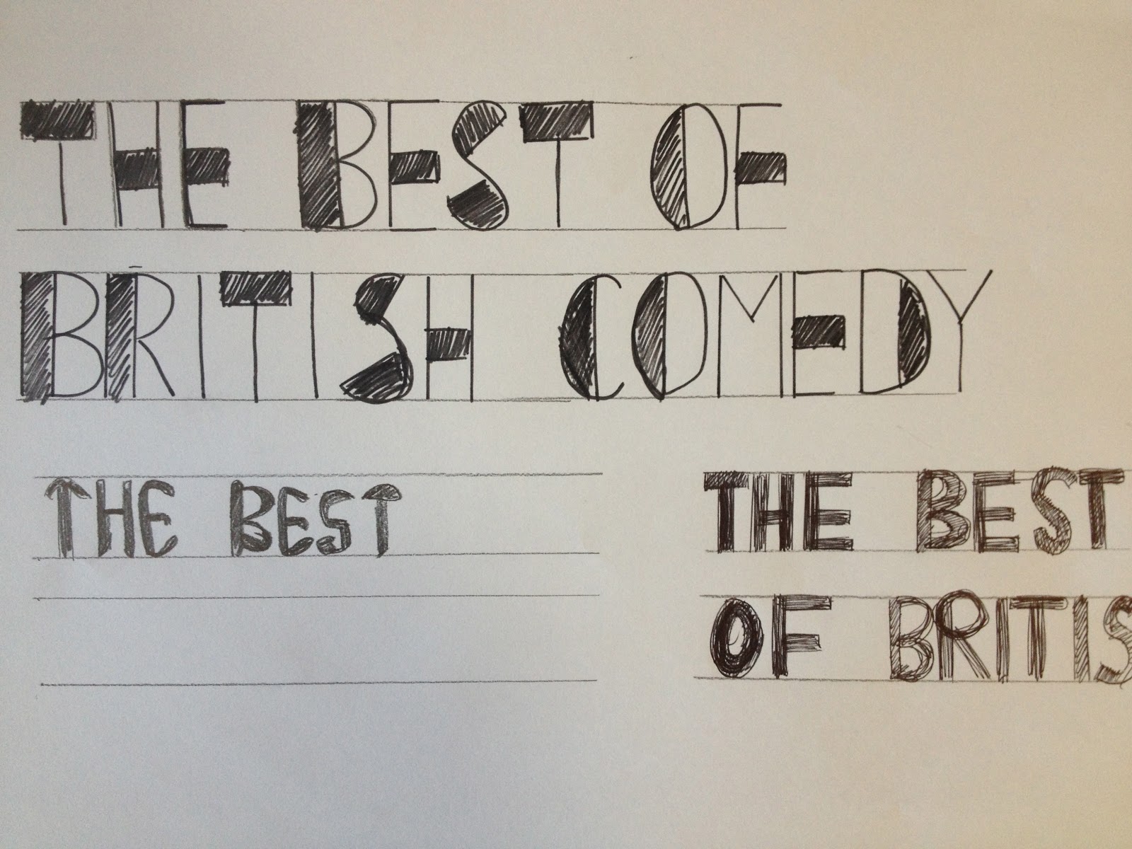
Typography on the packaging
Once looking at visual elements that could be used on my packaging I have now moved onto looking at type that I could us on my design, the quick sketches below (not accurate) show the different options of type that I have for different areas of my packaging. Some of the type below is will clearly not work and is clearly not suitable for my packaging.
Although this type has fairly comical body through the weight of each letterform I feel that this type would firstly outweigh the focal point of the main cover of the packaging which is going to be the silhouette of Morecambe & Wise.
I think that this kind of type is more appropriate for the main type for the packaging design, as we can see her I have decided to increase the thickness of the stem on each of the 3 different versions.
After experimenting with different typography I feel that using this simple block style type would be most appropriate as the consistent type which will define the header on each fold out page of the packaging. As I have now established that this will be the most appropriate style of type I can now either create this typeface using illustrator or find a similar free downloadable version to use within my packaging.
DESIGN DEVELOPMENT
As I am going for a comical feel to the packaging I have decided to create the background of the net using this turquoise colour.
As we can see I have started the main development of y packaging by placing a filter over my sketch placing this in the centre of the main cover and finding the typeface using the initial typography sketches.
After looking at the foundation of the cover in closer detail I feel that the background colour is far too dark and not representative of 'The best of British Comedy'. The colour of the type also does not compliment the colour of the background.
After considering the design so far I decided that the hand drawn sketch did not look like it would work in terms of being competing with other dvd packaging sitting on a shelf in the shops. Therefore I decided to find a photograph of Morecambe & Wise and go ahead with this silhouette vector
Using skills learnt in the Illustrator tutorial I decided to make the vector silhouette of Morecambe & Wise on illustrator, using the pen tool I began to draw around the image.
After doing so I brought the vector on the packaging net and placed it on the main cover fitting comfortably in the centre of the segment of the net.
Adding a subtle yet beneficial to raise the focal point being the vector.
The vectors for the logo's 'dvd' and 'bbc' which are located to the left hand side and the right hand side on the same line.
Using the same colour as the main type on the main cover of the packaging I have applied it to the rest of the outer packaging making the cover of the packaging distinct and easily recognisable for the audience when folding the folds in.
Adobe Illustrator: Produced the tv silhouette
Experimenting with the type on this segment of the packaging, by putting it inside the tv as if it is a actual screen, however I found that the type looked a lot better on the outside of the tv screen.
Adobe Illustrator: Pen tool used to create the silhouette
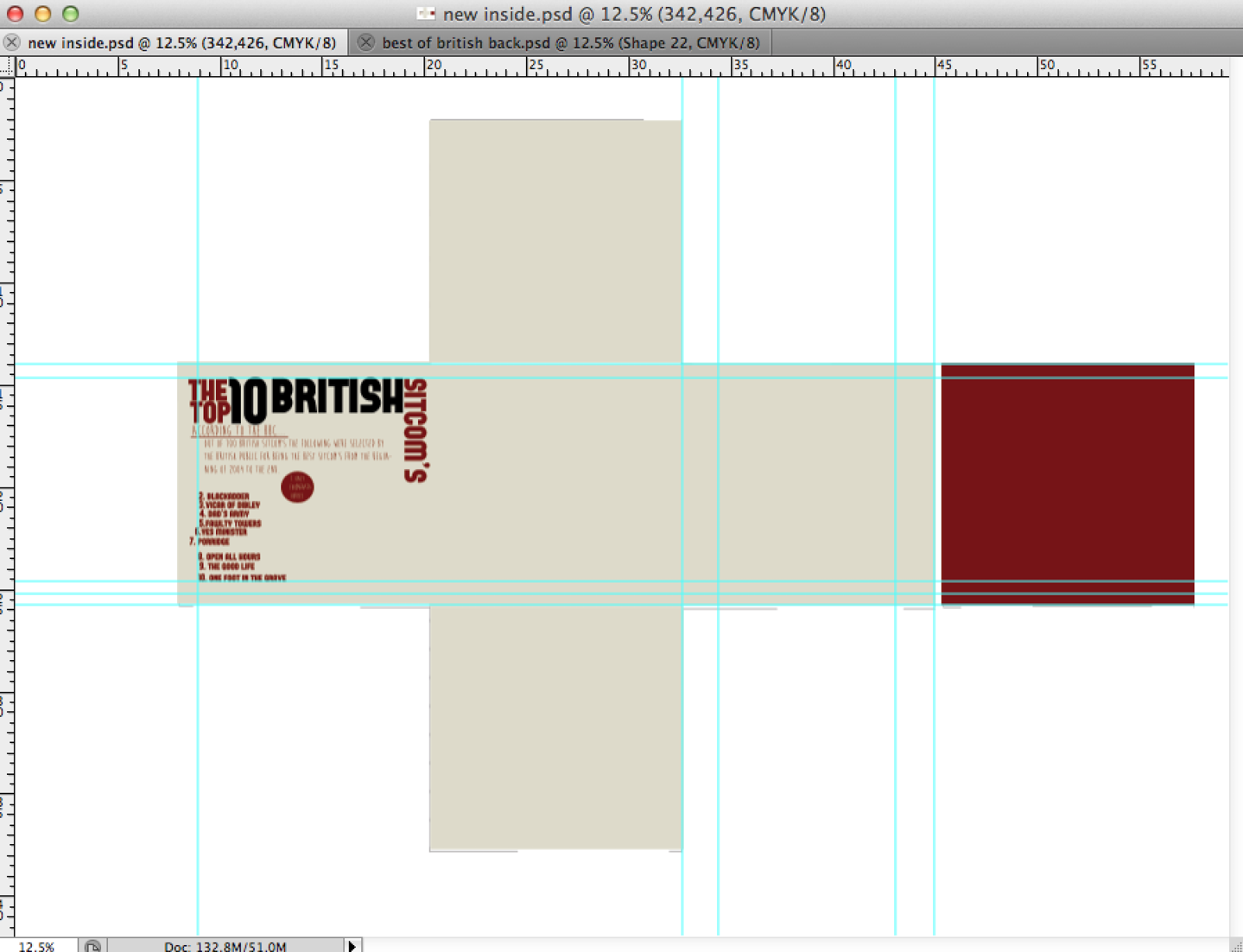
Inside packaging design
In order for the segments to look equal I have decided to leave a 1cm spacing around the edges in order for there to be clarity and consistency within the entire product
After placing the type on this section I started to input the info graphics onto the segment.
Once doing so I then moved onto placing the 'top ten british sitcoms' onto this circular web to create a tree type design.
Adobe illustrator: Using the pen tool created the podium, I then filled it in black in order to create consistency within my my vector illustrations.
The second part of collective info-graphic focuses on the BAFTA awards Morecambe & Wise have received over the years.
Adobe Illustrator: Producing the bafta award mask and producing a vector.
Once placing this info-graphic onto the bottom segment of the packaging I then moved onto producing the vector of the laughing jaw on illustrator, I then placed the this vector onto the net followed by the remaining type.
FINAL PRINTED PRODUCT